

Makers: 6 Letterman Jacket Fonts That Survive Chenille

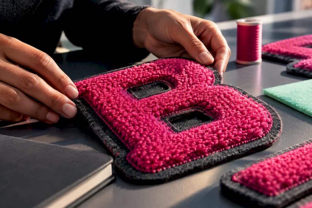
For commercial merch, Graduate and Alfa Slab One (both Google Fonts) are the safest, most authentic choices for varsity lettering, with Squada One and Anton covering condensed names and numbers. College on DaFont has the classic block look but usually needs a paid license before you sell anything. The rule that matters more than any single font: pick your production method first, chenille, embroidery, or print, then choose the typeface that survives it.
TL;DR:
- Choose your production method first, such as chenille or embroidery, before selecting the font to ensure it can survive the process.
- Fonts like Graduate and Alfa Slab One are the safest from a technical and licensing perspective for commercial merchandise.
- Design sizes typically range from 100 to 200 millimeters for patches, with outline thickness proportional to letter width for clarity.
- Verify font licensing through sources like Google Fonts or purchase the appropriate commercial license before production.
- Request a physical sew-out or sample at actual size to confirm the font’s durability and appearance before mass producing the jackets.
Table of Contents
- What Are the Best Letterman Jacket Fonts?
- How Do You Choose a Font Based on Production Method?
- What Size and Spacing Rules Apply to Jacket Lettering?
- Where Can You Get Varsity Fonts Without Licensing Trouble?
- What Files Do Manufacturers Need for Embroidered Lettering?
- How Maker of Jacket Approaches Font and Production Choices
- What Most Font Guides Get Backwards
- Get Your Varsity Lettering Made Right the First Time
- Sources
- FAQ
What Are the Best Letterman Jacket Fonts?
Varsity typography has a job to do before it has a style to show off. The heavy, uniform stroke weights and slab serifs you see on every classic letter jacket exist because chenille patches force those shapes to work. Thin strokes fray. Delicate serifs disappear under yarn loops. That constraint shaped the whole genre, and it’s why the fonts below keep showing up on real jackets instead of just mood boards.
- Graduate (Google Fonts): a clean collegiate serif with even weight distribution, strong for chenille-style patches and general merch lettering. Commercial-safe.
- Alfa Slab One (Google Fonts): a heavy slab built for large chest letters and patches where you need presence from across a room. Commercial-safe.
- College (DaFont): the archetypal block varsity letterform, the shape most people picture when you say “letterman jacket.” Often personal-use only, so buy a commercial license before it touches a product for sale.
- Squada One (Google Fonts): a condensed block face suited to names and jersey numbers where space is tight. Commercial-safe.
- Anton (Google Fonts): ultra-bold and condensed, built for maximum impact on large chest lettering. Commercial-safe.
- Rye and Sancreek: vintage-collegiate options with spurred slab details, good for decorative treatments like team mascots or throwback branding. Check the license on each before committing.
One more decision belongs on this list: whether to run a single letter style throughout, or pair a block font for initials with a script for a full name. Duo systems, block letter plus script signature, read as more custom and less template, but they only work if both faces survive the same production method. A script that looks great printed can turn into an unreadable blob in chenille. Match the pairing to the process before you fall in love with either font.
How Do You Choose a Font Based on Production Method?
The font decision and the production decision are really the same decision. Pick the process, then pick letterforms built to survive it, not the other way around.
Chenille and patch work demands solid, closed shapes with heavy weight. Fine serifs, thin connecting strokes, and tight internal counters (the enclosed space inside letters like “e,” “a,” or “o”) either clog with yarn or vanish entirely. Chenille letters are looped yarn stitched onto felt, and that texture simply cannot hold a delicate curve.
Embroidery has its own limits. Stitch density struggles with narrow counters, so wider, more open letterforms hold up better at small sizes. Digitizing guidance for embroidered apparel consistently points to simplifying detail rather than trying to preserve every quirk of a display font.
Print and heat transfer are the most forgiving. Distressed textures, fine outlines, and layered effects that would fail in stitching translate fine through DTG or vinyl transfer.
Use this order every time:
- Decide the production method first: chenille, embroidery, or print.
- Shortlist fonts whose stroke weight and counters match that method.
- Plan outline thickness and final sizing before finalizing the file.
- Request a sew-out or proof at the actual production size.
Pro Tip: Never approve a font based on a screen mockup alone. A letterform that looks bold and clean at 300% zoom can turn into mush once it’s actually stitched at 5 inches. Request a physical sample first.
What Size and Spacing Rules Apply to Jacket Lettering?
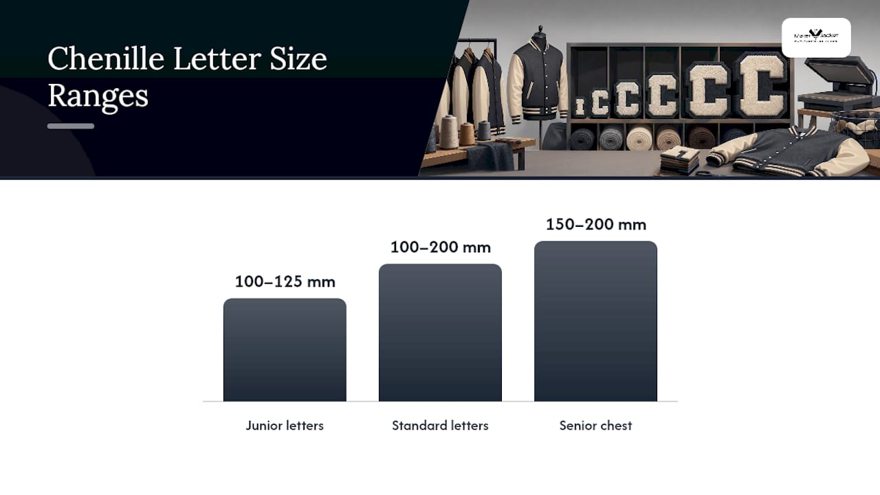
Size ranges follow tradition more than trend. Standard chenille letter patches run roughly 100 to 200 millimeters, with junior sizes around 100 to 125 mm and senior chest letters closer to 150 to 200 mm. Sleeve years and small marks usually sit well under 100 mm, which is exactly where thin fonts start to fail.
Outline thickness needs to scale proportional to letter width rather than fixed size. Typically, it should be thick enough to define the edges clearly without overwhelming the letterform.
- All-caps is the default for a reason: mixed case introduces ascenders and descenders that break the block silhouette varsity lettering depends on.
- For long names, tighten tracking slightly rather than shrinking the font size, it keeps letter weight consistent.
- Center-align chest lettering against the placket, not the jacket’s visual center, since body shape skews perception.
- Felt and yarn contrast matters as much as the font itself. A mockup on screen rarely predicts how a color pairs against wool melton until you see a physical sew-out.
Where Can You Get Varsity Fonts Without Licensing Trouble?
Licensing mistakes are the most common way a good font choice turns into a legal headache. Google Fonts families like Graduate, Alfa Slab One, Squada One, and Anton carry commercial-use licensing by default, though it’s still worth checking each project’s specific terms before mass production.
- Google Fonts (Graduate, Alfa Slab One, Squada One, Anton): generally safe for commercial merch, license terms rarely change.
- DaFont listings such as College: frequently personal-use only, purchase a commercial license before selling anything built on them.
- Layered or outline font systems: buy from type foundries or marketplaces like Creative Market rather than free font aggregators.
- Keep every license receipt on file and pass the license type along whenever art gets handed off to a production team.
What Files Do Manufacturers Need for Embroidered Lettering?
A clean handoff prevents most of the rework that eats up production timelines. Start with vector outlines in SVG, AI, or EPS, and note the exact final placement size on the file itself, not just in an email.
- Provide vector artwork with dimensions locked to the intended finished size.
- Expect your embroiderer to convert that vector into stitch files, typically DST or PES format, on their end.
- Include fabric type, backing material, expected outline width, and precise color codes in the same handoff package.
- Request a physical sew-out for every size and placement combination before approving a full run.
That last step isn’t optional busywork. Density and underlay settings that look perfect at 6 inches can fail completely at 3 inches, so each size functions as its own separate approval, not a simple scale-down of the last one.
Pro Tip: If you’re digitizing for chenille specifically, ask your embroiderer to convert letterforms into single closed shapes with consistent underlay and a chain-stitch outline. That combination compensates for yarn pile and keeps edges from looking ragged after wear.
How Maker of Jacket Approaches Font and Production Choices
Maker of Jacket treats font selection as a production question from the first sketch: we match letterforms to chenille, embroidery, or print before a single stitch file gets made. Every custom order runs through digitizing, a physical sew-out, and a sizing approval before full production starts. If you want production-aware advice on a font before committing, our custom design workflow walks through exactly how that process works.
What Most Font Guides Get Backwards
Most roundups of letterman jacket fonts treat typography as a purely visual decision, then bolt on a licensing footnote at the end. That order is backwards. The font that wins on a mood board and fails in chenille costs more in rework than any license fee ever would.
The conventional advice, “pick a font that captures the vintage collegiate feel”, isn’t wrong so much as incomplete. Plenty of gorgeous vintage-inspired faces have thin strokes or open counters that simply do not survive being stitched into felt. The visual language of varsity lettering came from the manufacturing process itself, not the other way around. Treating that history as decoration rather than a design constraint is where most DIY jacket projects go wrong.
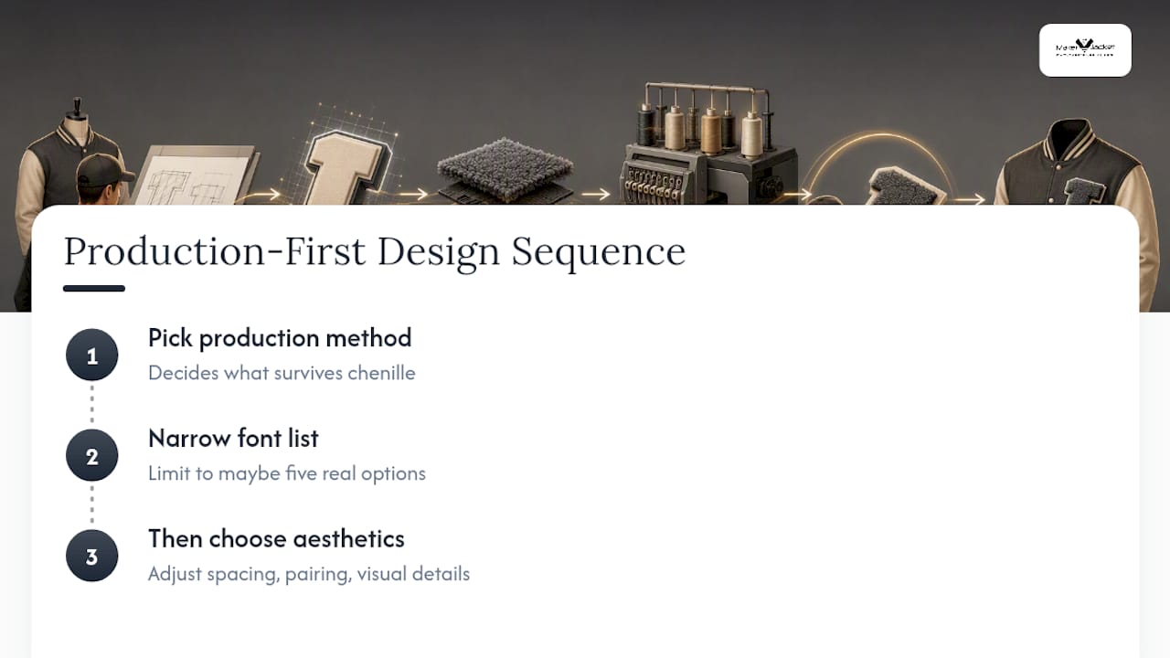
If you take one thing from this guide, let it be sequencing. Choose the production method first. Let that choice narrow your font list to maybe five real options. Then argue about aesthetics, spacing, and pairing. Skip that order and you’ll spend more time troubleshooting a sew-out than you ever spent picking the typeface.
— Maker
Get Your Varsity Lettering Made Right the First Time
Picking the right font solves half the problem. Getting it stitched correctly at the right size, on the right backing, with an outline that survives real wear, is the other half, and it’s the part most DIY font guides never touch. A production step that includes choosing a method, digitizing, and sewing out a letter before committing to a full run helps ensure fonts like Alfa Slab One at 150 mm hold up in chenille.
Ordering follows a simple path: pick your production method, select a font that matches it, request a sew-out sample, then confirm the run. If you’re ready to see it done, start your custom varsity jacket order and get a sample approval before your full batch goes into production.
Sources
- How to use alumni sans / collegiate one font
- What is varsity letterman? Design style guide & examples | Curio
- Varsity fonts (roundup and license guidance) — Made Good Designs
- Embroidery Digitizing for Sweatshirts and Jackets | DigitEMB
FAQ
What’s a Good Varsity Font?
Graduate and Alfa Slab One, both available through Google Fonts, are solid starting points because they carry commercial licensing and hold up well in chenille and embroidery. Squada One and Anton work better for condensed names and numbers where space is limited.
What Font Is Used for School Letters?
Classic school letters typically use heavy block or slab serif faces like College or Alfa Slab One, styles built around solid strokes and minimal fine detail so they translate cleanly into chenille patches. The exact font varies by school and manufacturer, but the block silhouette stays consistent.
What Font Is Similar to Varsity in Canva?
Anton and Alfa Slab One are both available as web fonts and give you that same bold, condensed varsity look inside most design tools, including Canva. Squada One works too if you want something slightly more compact for jersey-style numbering.
What Is the Varsity Team Font?
There’s no single official “varsity team font.” The category refers to a family of heavy block and slab serif typefaces, College, Alfa Slab One, Graduate, and similar faces, that share the stroke weight and proportions chenille patches require. Choosing among them comes down to your production method and licensing needs, considerations that should be evaluated before any lettering goes into production.


